
From Chaos to Clarity: A Unified Component Library for All UI Platforms
Insight
10
min read
If you’ve ever tried building one UI system that works everywhere, you know the chaos that comes with it.

My Experience Working Across Different Products and Engines
Over the years, I’ve worked on a wide range of products:
web platforms, mobile apps, enterprise systems, Unity and Unreal Engine interfaces, and even AR/VR tools.
No matter the platform, the components looked familiar — buttons, inputs, cards, navigation bars.
But the moment you switched engines or ecosystems, those “familiar” components suddenly behaved like completely different creatures.
For example:
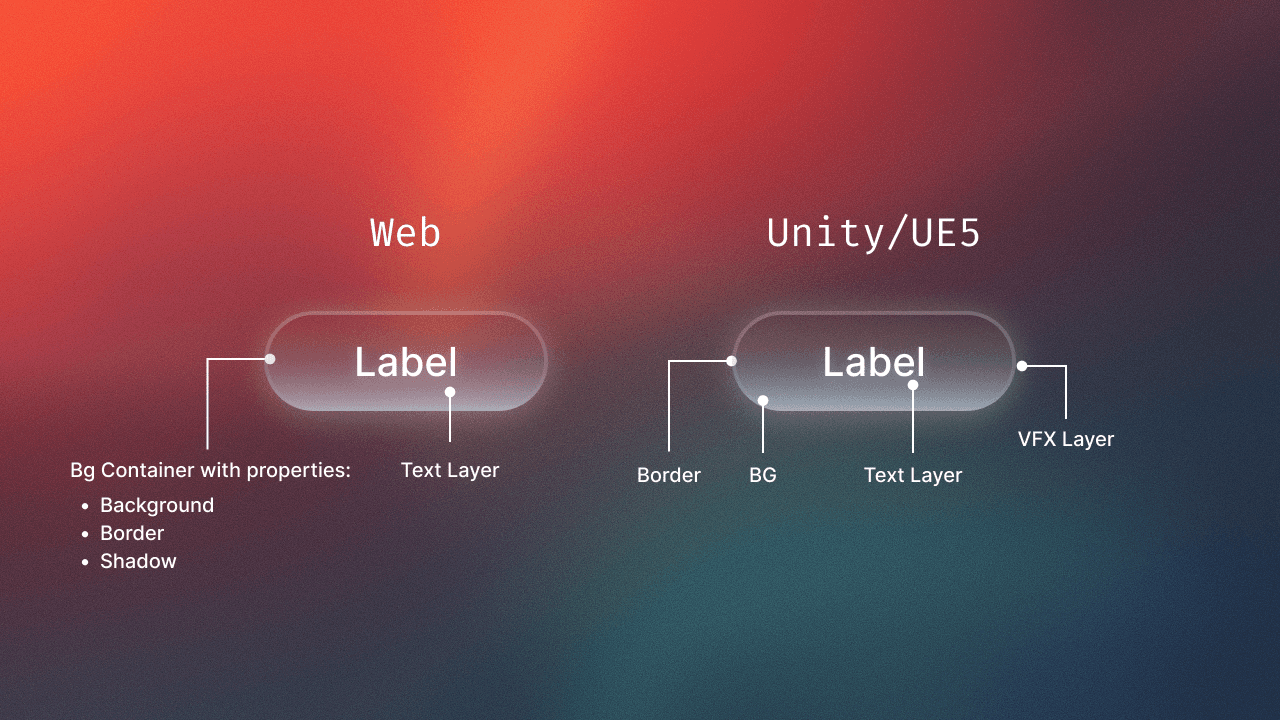
In Web, a button is simply Container + Label.
In Unity or Unreal, the same button becomes a multi-layer element with BG, Border, Icon, Label, Hover, Pressed, Focused, Disabled, and sometimes VFX overlays.
In mobile or enterprise apps, an Input field can easily include 6–9 layers: Label, Placeholder, Helper, Error, Cursor, Icons…
Every platform used its own structure, naming, and logic.
At some point, it felt like I was constantly translating between three UI languages.
That recurring friction is what led me to create a cross-platform UI naming template — so teams don’t have to struggle the way I did.
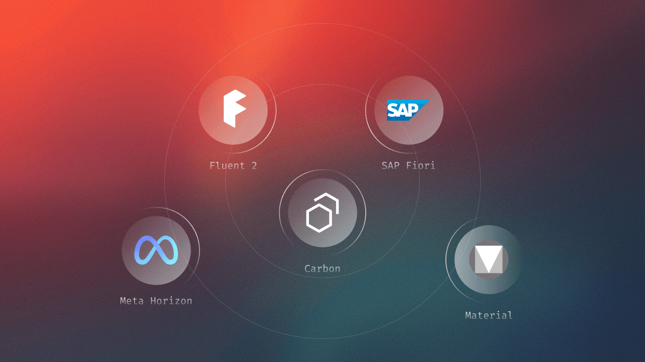
A Quick Tour of Major Design Systems
If you look at the big design systems, they all have clear, well-defined purposes.
And understanding those purposes explains why components differ so much across platforms.
SAP Fiori
Built for enterprise software, dashboards, workflows, ERP systems.
Optimized for clarity, consistency, and predictable business operations.
Material Design (Google)
Focused on mobile and web interfaces.
Prioritizes simplicity, accessibility, typography, and clear component hierarchy.
Fluent (Microsoft)
Designed for Windows, Office, and multi-device experiences.
Emphasizes motion, adaptable layouts, and flexible input types (mouse, keyboard, touch, pen).
Meta Horizon / Oculus UI
Built for spatial interfaces in VR/AR.
All about depth, distance, gaze interaction, and 3D component structure.
Each system is excellent in its domain —
but none of them solve the problem of how to unify components across multiple worlds (Web → Game → Mobile).
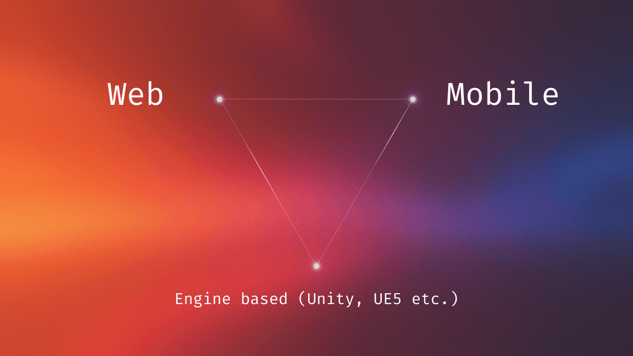
Web vs Unity/UE5 — One Component, Two Completely Different Realities
The easiest way to show why cross-platform UI is challenging is to compare the same component — for example, a button — in two worlds.
Typical Web Button Structure:
Container
Label
That’s it. Browsers handle focus, hover, click states automatically — the designer adds minimal styling.
Web UI follows the logic of systems like Material and Fluent:
clean, lightweight, predictable.
Unity / Unreal Engine 5 (Game UI, simulations, 3D products)
Purpose: responsiveness, visual feedback, immersive states.
A “simple” Game UI Button often includes:
BG
Border
Icon (optional)
Label
Hover state
Pressed state
Focused state
Disabled state
Sometimes VFX overlays
Instead of 1–2 layers, you easily get 8–12.
Why? Because in games, visual feedback is part of the gameplay experience — not just an interface detail.
So why are they so different?
Because each environment is solving a different problem:
Web focuses on information and clarity.
Game UI focuses on reaction, state changes, and immersion.
Mobile/Enterprise focuses on validation, readability, and flows.
Even when components share the same name, they behave like they live in different universes.
That’s why cross-platform naming is so hard — and why so many teams get lost when switching between engines.
I Created a Template to Help Teams Study Cross-Platform UI Guidelines
To simplify this entire process, I prepared a ready-to-use Figma template that helps you explore how components behave across Web, Game UI, and Mobile systems.
Inside the template, you’ll find:
A unified component structure
Naming conventions for Web, Unity/Unreal, iOS/Android
Visual examples in mid-fidelity
Layer breakdowns for each platform
A cross-platform comparison chart
Recommendations for aligning naming inside mixed teams
Test, expand, experiment